A building’s sign is often the first statement an organization makes to visitors. Signs not only reflect location, but can offer welcome and represent an ethos. Dwell Community Church has just finished replacing signs at its venues--Main Campus, the Warehouse, the 4th Street facility, and Building X--giving a consistent look at all locations.
The signs incorporate the newly designed Dwell logo and font, offering a modern look and reflecting Dwell’s mission. And because of the current business climate, Dwell was able to complete the project at a lower cost.
Dwell Operations Division Coordinator Steve Bauer says Dwell budgeted $36,000 for the entire project, but was able to complete it for less than $30,000. “We offered vendors great flexibility--they could schedule their work with no major time constraints and we offered to help with installation. They were able to offer very attractive quotes for the work."
Steve says the cohesive look at all locations reflects an important reality. “Not only did this project allow us to match our new name to our places of ministry,” Steve says, “but we were able to provide a common look-and-feel across venues that really ties us together as the one church we are, across central Ohio.”
And Steve says signs are vitally important, serving to identify Dwell facilities, and ensuring there’s no confusion about the church name for visitors, vendors, and members.
While the project was prompted by the name change, it fixes a long-standing issue with inconsistent signage. The old “Xenos” signs were developed and installed as each space was opened, reflecting different logos and fonts--ranging from Main Campus’ opening in 1997 to the Warehouse’s opening in 2014.
Here are more of the new signs at Dwell venues:
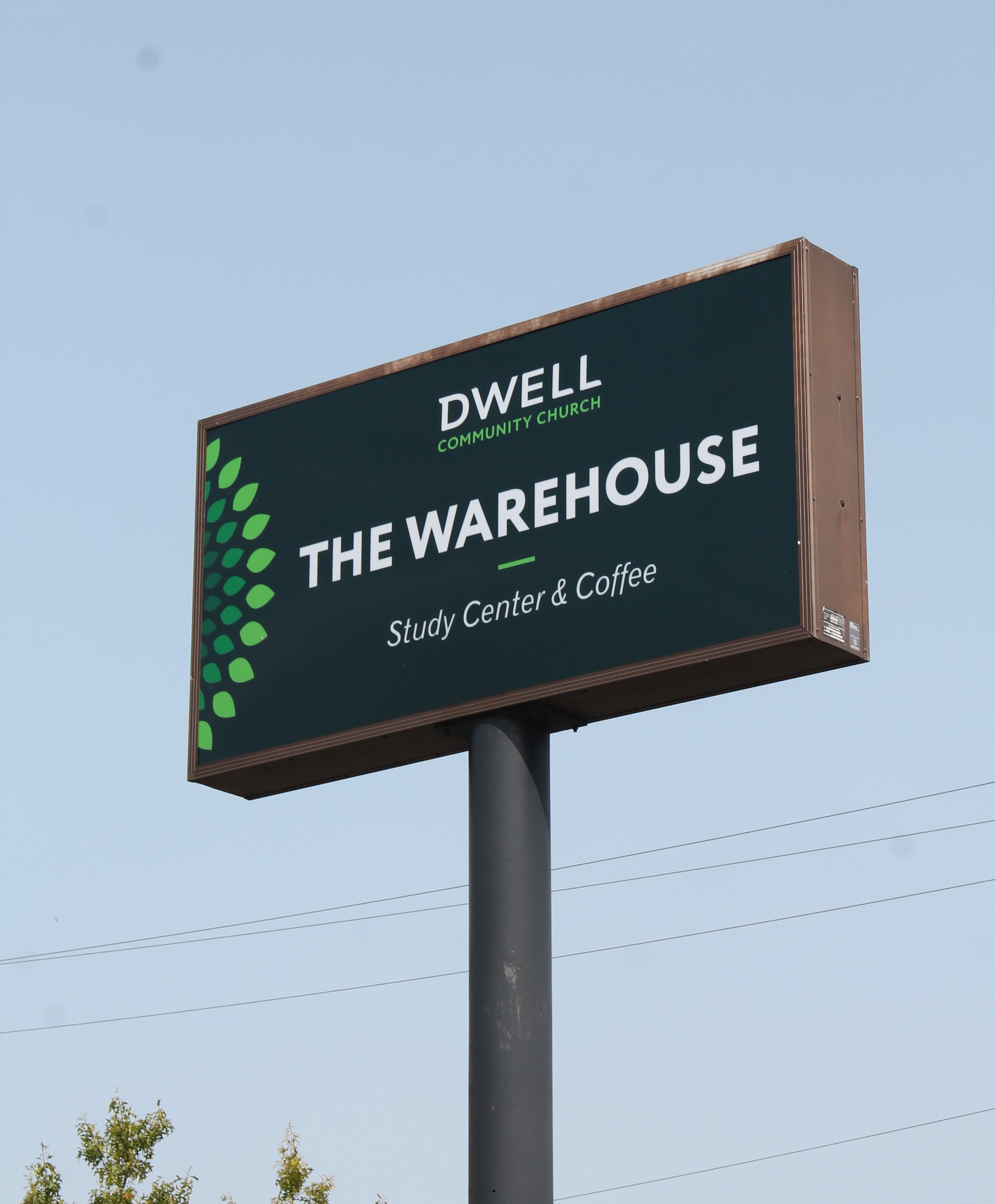
Sign at the Warehouse facility on Oakland Park

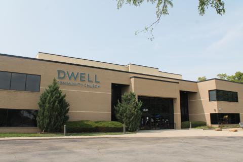
The Warehouse building sign
Main Campus building sign

Main Campus sign facing I-270